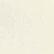
Are you looking to better your marketing? Have you ever asked yourself, "how can I use fonts to create better marketing?" While the graphic designs, layouts, pictures-- and of course, content—are all very important, many people overlook the importance of the font! While pictures are captivating, the layout makes it easy to navigate the page, different designs are pleasing to the eye, and the content is informative, the font ties the whole thing together. Let’s face it, after your eyes travel around the page, which hopefully has a clean, easy to navigate layout, the next thing to do is read the content!
Have you ever visited a page that you really wanted to skim but ended up leaving, looking for something different because it was too hard to read? Maybe the font was too small, or too bold, or too ornate. Maybe the colors were too jarring or clashed with one another. All of these are important factors when choosing fonts for you website or marketing materials!
Before we get down to it, let’s go over some basics about fonts, typefaces and spacing techniques.
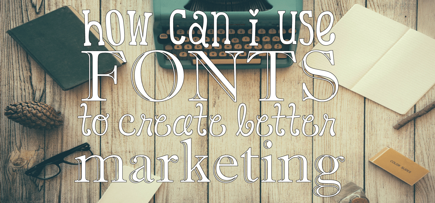
So, you’ve probably seen some popular typefaces such as “(Fill in name here) Sans” or, “(Fill in other name here) Sans Serif. Well, what the heck is a serif and why is it important? A serif is that little stroke you see at the end of letters. You know Times New Roman and how it has a cap at the end of each letter? That’s the Serif. A typeface without this stroke is referred to as “Sans Serif” because it’s…well…sans the serif. Make sense?
Now why is this important to marketing and writing content? Well, Sans Serif fonts are much easier to read than Serif typefaces! Readability is the number one factor of drawing in your reader and keeping them reading--as long as the content is interesting, of course ;). Think about it: if you can’t see the words well, it slows you down. If you’re slowing down, the longer it will take you to read it. Skimming an article is near impossible. You lose interest and move onto the next one. It doesn’t matter what the content is if your reader can’t read it!
What is kerning, tracking and leading you may ask? Well…
Kerning
Kerning refers to the spacing between letters. Why is this important to take into consideration? Because if your letters are too close together, thenyourwordsgetsmushedtogether, making it unpleasing to the eye. Same goes for if they are too far apart. You want your kerning to be the perfect balance.
Tracking
Tracking involves adjusting the spacing throughout the word, which sounds exactly like kerning, but it is actually different. When you think of tracking, think of readability. It’s important for longer words and sentences to look clean and easy to read. If your brain has to think too hard and long to figure out what a word is, interest drops considerably.
Leading
Leading refers to the spacing between lines. When you’re taking into consideration what the paragraph looks like as a whole, you need to consider your leading. Again, readability is what you’re concerned with. If the lines are too far apart or too close together, it’s hard to read.
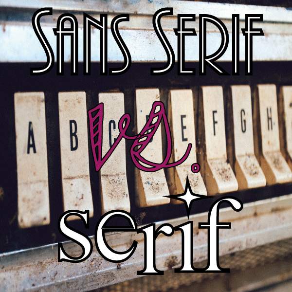
Well, now that we’ve picked a good font, have our perfect kerning, good tracking, and appropriate leading, it’s time to talk about the three rules of good typography:
consistency
hierarchy
alignment
You always want your fonts to remain consistent. Switching between Sans Serif and Serif typefaces is probably not your best bet. And while we’re talking about consistency, alignment of text should always be consistent. Rulers or guides in the program that you’re using are there for exactly this reason.
By hierarchy we’re talking about headlines. Headlines should always stand out, whether they are bold, bigger, colored or underlined; the reader should be able to distinguish different topics from the main body of the copy.
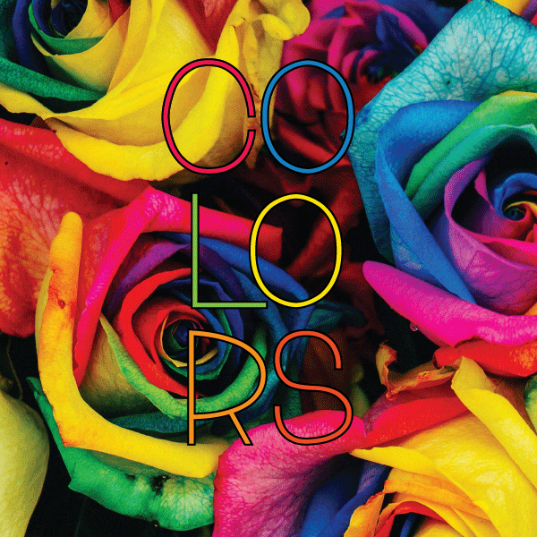
Another important aspect of choosing fonts is the color. Pick a color palette for your brand or page and stick with it. But, make sure it’s captivating while also being easy to read. Red on black is obviously easy to read; yellow on white, not so much.
Choosing the right font for your page is important for multiple reasons. For one, and the most important, it makes your content readable! But, we’ve covered that already, so let’s move onto our next important point: it also improves your marketing by creating a well-known brand. When you stay consistent with your fonts, colors and spacing, people come to recognize your work and become more familiar with your style, creating a more intimate feeling. Blogs, especially, thrive on intimacy. If your reader can connect with what they are reading, then you will soon have a fan base! But remember, to get them reading, you need that perfect font!
So experiment with your fonts, typefaces, and colors! There’s nothing wrong with a little trial and error, but once you find what works, stick with it!
This article will explore the use of fonts in marketing and how they can be used effectively to boost brand identity and engage audiences.
The importance of typography in marketing and its impact on brand perception will be discussed.
Key findings will cover the psychology of fonts, choosing the right font for your brand, typography trends, font pairing, and real-world use cases.
In the world of marketing, fonts play a crucial role in conveying brand identity and messaging to consumers. The choice of font can evoke specific emotions and perceptions, making it essential to select the right one for your brand. This article will delve into the psychology of fonts, provide tips on choosing the perfect font for your brand, explore current typography trends, and offer strategies for maintaining consistency across different marketing platforms. By understanding the power of fonts in marketing, you can effectively enhance your brand identity and connect with your target audience on a deeper level.
The Psychology of Fonts
Fonts have the power to evoke different emotions and perceptions in consumers. For example, serif fonts are often associated with tradition, reliability, and respectability, making them a popular choice for more formal brands. On the other hand, sans-serif fonts are seen as modern, clean, and approachable, making them a good fit for brands looking to convey a sense of innovation and simplicity.
Emotional Impact of Fonts
Research has shown that certain fonts can trigger specific emotional responses in individuals. For instance, bold and thick fonts are often perceived as strong and confident, while thin and delicate fonts can evoke feelings of elegance and sophistication. Understanding the emotional impact of different fonts can help marketers choose the right one to align with their brand's messaging and values.
Choosing the Right Font for Your Brand
When selecting a font for your brand, it's essential to consider how it aligns with your brand identity and messaging. The font you choose should reflect the personality of your brand and resonate with your target audience. For example, a playful and whimsical font may be suitable for a children's brand, while a sleek and modern font may be more appropriate for a tech company.
Brand Consistency
Consistency is key when it comes to font selection in marketing. Using the same font across all marketing materials helps to reinforce brand recognition and create a cohesive brand identity. Make sure to choose a font that is versatile enough to be used across different platforms and mediums while maintaining a consistent look and feel.
Typography Trends in Marketing
Typography trends in marketing are constantly evolving, with new styles and techniques emerging each year. Keeping up with these trends can help your brand stay relevant and engage with your target audience effectively. From bold and oversized fonts to minimalist and clean typography, there are endless possibilities to explore in the world of typography.
Custom Fonts
One of the current trends in typography is the use of custom fonts to create a unique and memorable brand identity. Custom fonts can help your brand stand out from the competition and convey a sense of creativity and originality. Consider working with a designer to create a custom font that aligns with your brand's values and personality.
Who Can Benefit from Using Fonts in Marketing
Fonts in marketing can be beneficial for a wide range of individuals and businesses, including:
Marketing professionals looking to enhance brand identity
Graphic designers seeking to create visually appealing materials
Small businesses aiming to establish a strong brand presence
Entrepreneurs looking to connect with their target audience
Brands wanting to differentiate themselves from competitors
When to Incorporate Fonts in Marketing Materials
Fonts should be strategically used in marketing materials to maximize their impact. Consider incorporating fonts in the following scenarios:
Creating a new brand identity or rebranding effort
Designing promotional materials for a product launch
Developing a marketing campaign to engage with customers
Revamping your website or social media presence
Designing print materials such as brochures or business cards
Examples of Effective Font Usage in Marketing
Real-world use cases of successful font usage in marketing include:
Apple's use of the San Francisco font for a clean and modern brand image
Coca-Cola's iconic use of the Spencerian script for a classic and timeless feel
Nike's bold and impactful use of the Futura font for a strong and dynamic brand identity
Google's playful and friendly use of the Product Sans font for a welcoming and approachable brand persona
Starbucks' use of the Siren font for a unique and recognizable brand identity across all touchpoints
What Sets Our Product Apart
Our product stands out from the competition due to its unique approach to font selection. We offer a wide range of custom fonts that are specifically designed to enhance brand identity and engage with target audiences effectively. By using our product, you can create a memorable and impactful brand image that resonates with consumers on a deeper level.
Custom Font Options
Our product provides access to a diverse selection of custom fonts that are not available anywhere else. These fonts are carefully crafted to align with different brand personalities and messaging, allowing you to choose the perfect font that reflects your unique identity.
Ways to Utilize Our Product
Our product can be used in a variety of marketing scenarios to maximize its impact and effectiveness. Whether you are creating promotional materials for a product launch or revamping your website, our custom fonts can help you stand out from the competition and create a strong brand presence.
Brand Identity Enhancement
By incorporating our custom fonts into your marketing materials, you can enhance your brand identity and create a cohesive look and feel across all touchpoints. Consistent font usage helps to reinforce brand recognition and establish a strong brand presence in the minds of consumers.
Getting the Most Out of Your Adventure with Our Product
To fully leverage the power of our product, it's essential to explore all the features and options available. By taking the time to experiment with different fonts and styles, you can discover the perfect combination that resonates with your target audience and effectively communicates your brand message.
Font Pairing Tips
Experiment with different font pairings to create visual interest and enhance your brand messaging. Consider pairing a bold headline font with a more subtle body text font to create a dynamic and engaging design. By exploring different font combinations, you can find the perfect balance that captures the essence of your brand.
Font-tastic Takeaways
Fonts are a powerful tool in marketing that can significantly impact brand identity and audience engagement. By understanding the psychology of fonts, choosing the right font for your brand, staying up-to-date on typography trends, and maintaining consistency across platforms, you can effectively enhance your brand's messaging and connect with your target audience on a deeper level. Real-world examples showcase how successful brands have leveraged fonts to create a strong brand identity and connect with consumers. Incorporating fonts strategically in your marketing materials can help you stand out, establish a strong brand presence, and differentiate yourself from competitors. Remember, the right font can make all the difference in how your brand is perceived and remembered.