


Utilize Color for Better Mailing
- By Andrew Jacobs
- Jul 17, 2017
Utilize Color for Better Mailing
You may have noticed that here at JAM Paper, we have no shortage of colors when it comes to paper and envelopes. In fact, you might even say that we have EVERY color (and every size). Because we have provided you with this bountiful color selection, we thought it might be good if we also provided a brief guide to using these colors, and various color combinations, to your advantage. By pairing complimentary and analogous colored paper and envelopes, you can increase the chances that your business and personal mailings have of getting noticed and remembered by clients and recipients! Here, we will look at some complimentary and analogous color combinations represented in JAM's selection of products to help you make smarter choices when shopping for paper and envelopes! For a quick recap on color theory, complimentary colors are colors that lie across from each other on the color wheel (opposite colors). Analogous (similar) colors are those that appear next to or near each other on the color wheel.

Complimentary Combinations
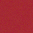
1. Red and Green

This beautiful combination can be created with any of our red and green paper and envelopes. Our red envelopes are sold in a variety of shades and sizes, including Brite Hue Red Recycled, Burgundy, and Dark Red. Red Paper is available in these same shades and others. For something lighter in the same color family, see our pink paper and envelope options!
Our green envelopes are sold in Brite Hue Green, Ultra Lime Green, Green Recycled Parchment, Dark Green, Olive Green, Green Metallic, Leaf Green, Translucent Vellum Green, and Light Green! Green Paper is available in all of these colors as well as Mint Green and Chartreuse. Some of our suggested color combinations are brite hue red with bright hue green, green parchment with ultra pink, burgundy with dark green or racing green, brite hue red with racing green, and ultra lime with pink recycled parchment.
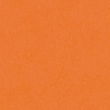
2. Orange and Blue

Frequently featured on beach towels and the jerseys of college sports teams, orange and blue is a classic color combination. Here at JAM, we have numerous shades of blue envelopes and paper, and a couple different shades of orange products as well to help you bring this color combo to you mailing projects. Choose from Orange Recycled Brite Hue, Ultra Orange Brite Hue, Dark Orange, and Mandarin Orange envelopes! Dark Orange, Orange Recycled Brite Hue, and Ultra Orange Brite Hue colors also appear among our election of orange paper! See also : Gold Paper options Let's talk about the blues. Among JAM's selection of blue paper, you will find Presidential Blue, Baby Blue, Navy Blue, Aqua, Brite Hue Blue , Sea Blue, Blue Parchment, Teal, and Sapphire Metallic. Blue envelopes are also available in all of these blue shades! Try Ultra Orange Brite Hue with Presidential Blue, Ultra Orange with Blue Brite Hue, Navy Blue with Dark Orange, Teal with Metallic Gold, Pastel Blue with Antique Gold, and more!
3. Yellow and Purple

Our yellow envelopes and paper comes in every shade of sunlight! These shades include Yellow Brite Hue, Light Yellow, and Sunflower Yellow! See also: Metallic Gold. Our beautiful and royalpurple paper and envelopes come in Violet Brite Hue, Dark Purple, Light Purple, and Ultra Grape shades! Try Dark Purple envelopes with Yellow Brite Hue, Metallic Gold, Light Yellow, and Antique Gold paper! Take a look at Ultra Grape and Violet Brite Hue Envelopes with Yellow Brite Hue or Sunflower Yellow. Use Light Yellow envelopes with dark purple paper. The way combine these colors is up to you! Now let's take a look at some analogous color options. Analogous colors appear next to other on the color wheel.
Analogous Combinations
1. Red, Dark Red, Burgundy, Pink, and Fuchsia

First, we will visit the upper right of the color wheel where the red family lives. At JAM, this family is represented most strongly by Red Brite Hue, Dark Red, Burgundy, and Jupiter Red envelopes and paper! More distant relatives reside in the pink family. Members of the pink family at JAM include Ultra Pink Brite Hue, Ultra Fuchsia Brite Hue, Baby Pink, and Pink Recycled Parchment envelopes and paper. Combine Burgundy with Dark Red, Dark red with Red Brite Hue, Pink Parchment with Burgundy, baby Pink with Ultra Fuchsia, and more!
2. Dark Purple, Ultra Grape, Violet Brite Hue

Now we will move to the top left of the color wheel. As mentioned above, JAM has a variety of purples including Violet Brite Hue, Dark Purple, and Ultra Grape Brite Hue. Violet and Ultra Grape paper both go beautifully with Dark Purple envelopes. If you're feeling experimental try the inverse of one of the two or of booth. If you truly love bright shades of purple, try ultra grape and and violet together!
3. Blue, Navy, Bright Blue, Presidential Blue, Sea Blue, Teal

Our great selection of blue colors was mentioned about in the orange and blue portion. Possible fantastic analogous color combinations that can be created with these blue shades are Sea Blue with Navy Blue, Blue Recycled Parchment with Presidential Blue, Aqua with See Blue, Presidential Blue with Navy Blue, Blue Brite Hue with Navy Blue, Aqua with Teal, and any other of your creation!
4. Bright Green, Dark Green, Lime Green

Now we will revisit our green paper and envelopes to explore the lively and appealing combinations that that can be created with them. Use Brite Hue Green paper with Dark Green envelopes, Green Recycled Parchment Paper with racing Green Envelopes, Ultra Lime paper with Olive Green Envelopes, Green Recycled Parchment with Ultra Lime (to even out the tones of each) and more.
5. Yellow, Light Yellow, Dark Yellow, Gold

Remember when we said that our yellow products come in every shade of sunlight? Why not combine some of these shades so that the mail you send will really brighten someone's day? Try Light Yellow with Yellow Brite Hue, Antique Gold with Sunflower Yellow, and other combinations of these colors. Keep in mind that Gold Metallic paper also fits in with tones of yellow!
6. Orange, Dark Orange

Orange paper and envelopes are available in Orange Brite Hue, Ultra Orange, Dark Orange, and Mandarin Orange. Red shades can also be analogous with shades of orange! If you want to make sure your next mailing will not go unnoticed, try some orange combinations. Use Orange Brite Hue with Dark Orange, Ultra Orange with Orange Brite Hue, Dark Oange with Ultra Orange, or Mandarin Orange with Dark Orange! Dark Orange and Dark Red also go together beautifully. We hope that you found our color guide helpful and this it helped you mail look eye-catching and coordinated! Do you have any questions or further color combination suggestions? Let us know in the comments!
Enhance Your Mailings with the Power of Color
When it comes to creating impactful mailings, utilizing color can make a significant difference in catching the recipient's attention and leaving a lasting impression. By incorporating vibrant and eye-catching hues, you can effectively convey your message and evoke emotions, ultimately increasing the likelihood of your mailings being noticed and remembered. Whether it's a promotional flyer, a direct mail piece, or a personalized greeting card, the strategic use of color can enhance the overall appeal and effectiveness of your mailings. From choosing the right color scheme to understanding the psychology of colors, there are various ways to leverage the power of color to improve your mailings and achieve your desired outcomes.
Benefits of Using Color in Your Mailings
Utilizing color in your mailings offers a multitude of benefits, including increased visibility, improved brand recognition, and enhanced communication of your message. Color has the ability to capture attention, convey emotions, and create a memorable experience for the recipient. By incorporating color, you can effectively differentiate your mailings from the sea of monotonous black and white envelopes, thereby increasing the likelihood of your mailings being opened and read. Additionally, color can help reinforce your brand identity and create a cohesive visual representation across all your marketing materials, strengthening brand recognition and recall among your target audience.
Practical Use Cases for Colorful Mailings
Colorful mailings can be effectively used for a variety of purposes, such as promoting special offers, announcing events, sending personalized invitations, and expressing gratitude. Whether it's a vibrant postcard promoting a sale, a colorful newsletter highlighting new products, or a personalized birthday card in cheerful hues, the use of color can significantly enhance the impact and effectiveness of your mailings. By tailoring the color choices to align with the specific purpose and audience of your mailings, you can create a visually compelling and engaging communication piece that resonates with the recipient and drives the desired response.
Alternatives to Traditional Color Choices
While traditional color choices can be effective, considering alternative color options can add a unique and unexpected twist to your mailings, capturing the recipient's attention in a fresh and innovative way. Experimenting with unconventional color combinations, bold gradients, or unexpected pops of color can create a visually striking and memorable impression, setting your mailings apart from the ordinary and mundane. By thinking outside the box and embracing unconventional color choices, you can infuse creativity and originality into your mailings, making them stand out and leave a lasting impact on the recipient.
Tips for Using Color Effectively in Your Mailings
When incorporating color into your mailings, it's essential to consider factors such as color psychology, readability, and brand consistency. Understanding the psychological associations of different colors and their impact on emotions can help you choose the most suitable color palette to convey your intended message and evoke the desired response. Additionally, ensuring that the text and graphics in your mailings are legible against the chosen background colors is crucial for effective communication. Furthermore, maintaining consistency with your brand's color scheme across all marketing materials can reinforce brand recognition and create a cohesive visual identity.
Maximizing the Impact of Color in Your Mailings
By strategically utilizing color in your mailings, you can maximize their impact and effectiveness, ultimately achieving your communication and marketing objectives. Whether it's creating visually captivating designs, leveraging the psychological influence of colors, or maintaining brand consistency, the thoughtful use of color can elevate the appeal and success of your mailings. Embracing creativity, exploring alternative color choices, and understanding the principles of effective color usage can empower you to create compelling and memorable mailings that resonate with your audience and drive desired outcomes.